

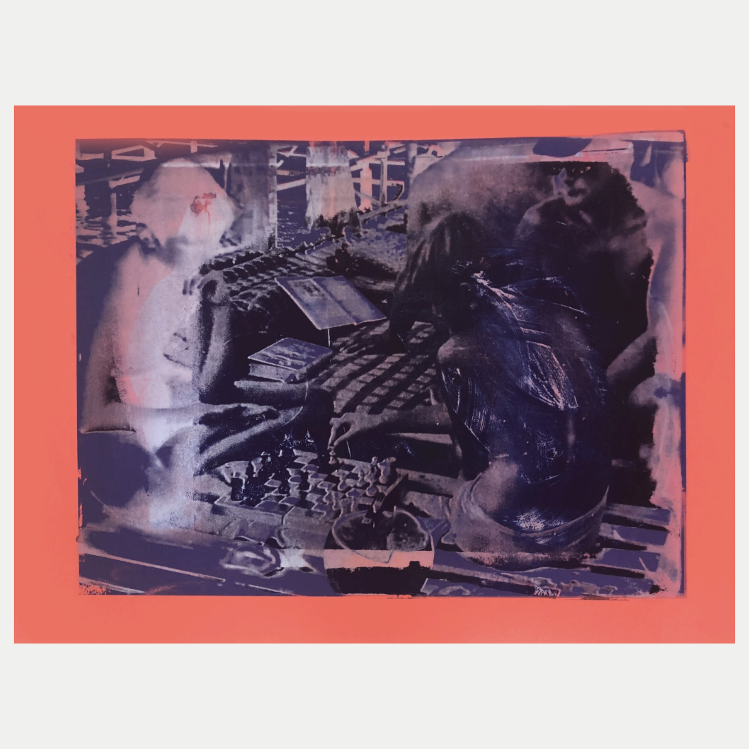
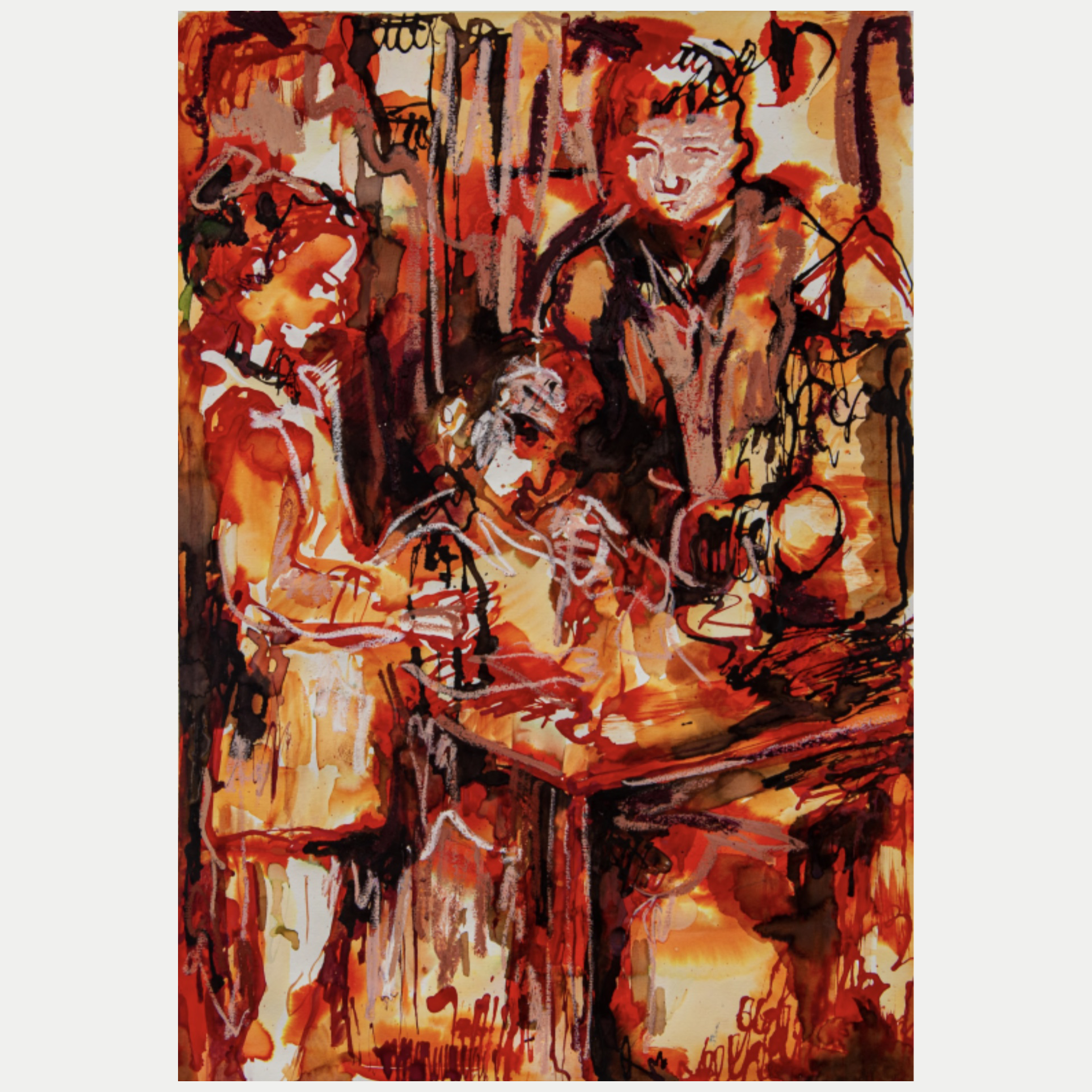
Katya Granova’s practice is driven by a desire to penetrate the past and rebel against the irreversibility of time. Working primarily with vintage photographs, she uses them as entry points into memory—images that offer a glimpse but not access, shaped by the selective eye of the photographer. For Granova, the photograph is a flawed time machine, offering fragments that conceal as much as they reveal.
Born in the USSR shortly before its collapse, she spent her childhood amid the cultural ruins of a vanished system. Family stories of the Soviet era were often contradictory, while her school history books were rewritten in real time. This unstable relationship to the past instilled in her generation a deep skepticism toward historical narratives. What does it mean to know the future if the past itself is uncertain—or missing?
In her work, Granova alters, abstracts, and fictionalizes photographic images, whether from her own family archive or discovered in flea markets. Her gestural marks—made through bodily movement—imprint the images with a physical presence, reclaiming them from historical distance. By translating signs of "oldness" into painted form, she asserts her own subjectivity and reorganizes visual space, thinking through the act of painting.
Her large-format canvases function less as windows and more as portals—spaces into which she inserts herself. By disrupting photographic perspective and collapsing foreground and background into a dense, tactile surface, she transforms static images into visceral, painterly experiences.
Granova’s work is a sensual dialogue with the past—an act of resistance against the supposed objectivity of history and a search for meaning within its cracks.
Katya Granova
Browse available works:
Artist interview:
How would you describe your artistic practice?
My artistic practice is predominantly painting and printmaking, I normally use found old black and white photographs of unknown people as a base compositions for my works. The unapproachability of the past, caged in the photographs, the mundane everyday history, which is often forgotten and updated to serve certain ideology - these qualities of the photograph gives me a desire to interact with them and insert myself in them, which I do through the open gestures and intuitive colour choices while painting or printmaking over the transfered photographs.
What concepts appear consistently in your practice?
The main concepts in my work is memory and I employ the physicality of paint and it's nature of touch to approach it.
What techniques or materials do you frequently use?
I mostly use oil painting, also silkscreen printmaking, cyanotype and various analogue techniques of photo transferring.
Katya Granova